3 minutes
What’s With the Logo?
I used to teach high school science, chemistry typically. In that, I was always in search of something for the first days of school. The options were usually something like:
- talk through the syllabus
- leap directly into unit 1
- try to do something short but meaningful
I did select numbers 1 and 2 on occasion, but had more fun with number 3. Mixed success, but more fun. I took the first day or two of class to:
- build paper towers and model iterative design
- extrapolate the rules of cube and board games1
- look at and talk about optical illusions and cognitive biases
- talk about the scientific method with the little paper puzzle below as an example
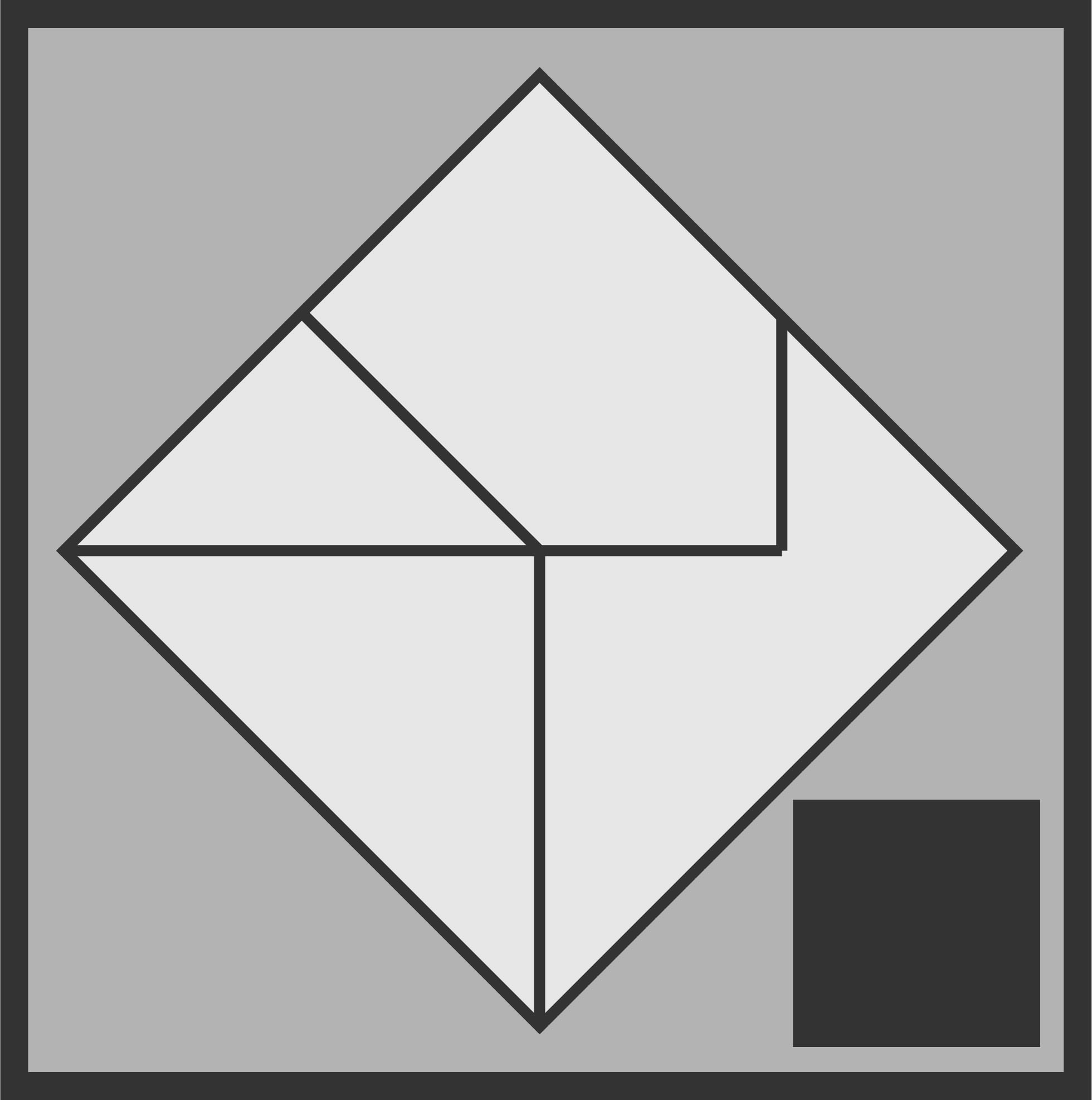
It looks like the logo at the top of the screen, yes? Here’s the conceit, if you didn’t take a look at the linked page. If you’re a very interested high school student, you get handed the above four puzzle pieces and told to make a square. It doesn’t take long, and I would make the connection to slotting together disparate facts into a workable model of reality.
It’s a chemistry course usually, so I may say something about 19th century explorations into electromagnetism and earlier Age of Enlightenment bookkeeping around chemical reactions leading to atomic theory and a model of individual atoms that includes stationary, widely distributed electrons2.
Your model fits the data. Great! But, what’s this?
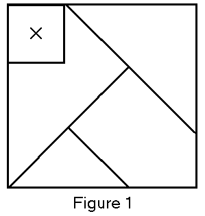
That small, square fifth piece makes things awkward if presented after you already have the first four slotted together. I might ask you:
- Why is it hard?
- What did you have to do to make that piece fit?
- Was it possible to shift just a single piece to accomodate the new one?
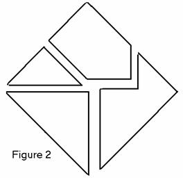
Keeping the conversation in the realm of famous chemistry experiments, the much-exampled demonstration by Ernest Rutherford’s group of the existence of atomic nuclei in gold foil really throws a wrench into existing models.
What do you do in this case? That’s another question for students, but also for all of us. There’s an issue in the teaching of science where we over-streamline our narratives, making historical scientific work sound like a steady linear climb toward enlightenment. That’s a function of time, teacher knowledge, and student patience, and it flattens reality to a certain degree.
It’s easy under this simple, unemotional paradigm to give the right answer. What do we do? We blow up the model and make a new one, fearlessly incorporating the new information as well. Students get there easily, and often with a shrug.
That’s what science is, succinctly. There’s more to it, and human foibles, a word which is carrying weight from ego to crimes, enters in. We’re talking about a ruthless empiricism that admits no sacred cows. Quite a paper puzzle, right?
So, why is it the logo? It’s an aspiration, and a mission statement. I should be, we should be, just as willing to do that kind of destructive growth with all our ideas. Easy to say, yes? I’d like How to Know to be about doing that. You’ll notice the logo does not look exactly like either of the images above. I’d like to situate myself in the moment between these two images, settled into neither fully articulated model. There’s something beautiful about hanging between the two: new information recognized, but not incorporated. In the balance, there’s possibility. Let’s aim to tip over the right side.
| PARS Score | |
|---|---|
| P | ◼◼◼ |
| A | ◼◼◻ |
| R | ◼◼◻ |
| S | ◼◼◻ |
Much respect to Joe Cossette at Passionately Curious Sci. He makes cool things. ↩︎
The observant among you will recognize Sir Joseph John Thomson’s “plum pudding” model of the atom. ↩︎